{{ a.num }}
{{ a.title }}
{{ a.title }}
{{ a.desc }}
{{ a.tools }}
{{ t.hero_kicker }}
{{ t.hero_sub }}
Companies I’ve worked with














{{ t.ab_sub }}
{{ a.desc }}
{{ t.ab2_p1 }}
{{ t.ab2_p2 }}
{{ t.ab2_p3 }}
 Figma
Figma
 Claude
 ChatGPT
 Mobbin
 Mixpanel
 Miro
Miro
 Jira
Jira
 Maze
Maze
 Adobe
Adobe
{{ activeCase.tag }}
{{ activeCase.summary }}
{{ activeCase.overview }}
{{ activeCase.challenge }}
{{ ap.d }}
{{ activeCase.researchNote }}
{{ rp.d }}
{{ pe.d }}
{{ pr2.d }}
{{ activeCase.wireNote }}
I mapped every candidate feature with the team on an impact / effort matrix, then sequenced delivery: ship the quick wins first for fast value while the big bets were designed in parallel.
The research pointed at four clear problems with the legacy queue. I designed a deliberate answer to each.
The heart of SysAid. I rebuilt it around scanability and speed - clearer hierarchy, status and priority cues, bulk actions and multi-select - so agents move through queues with far less friction.
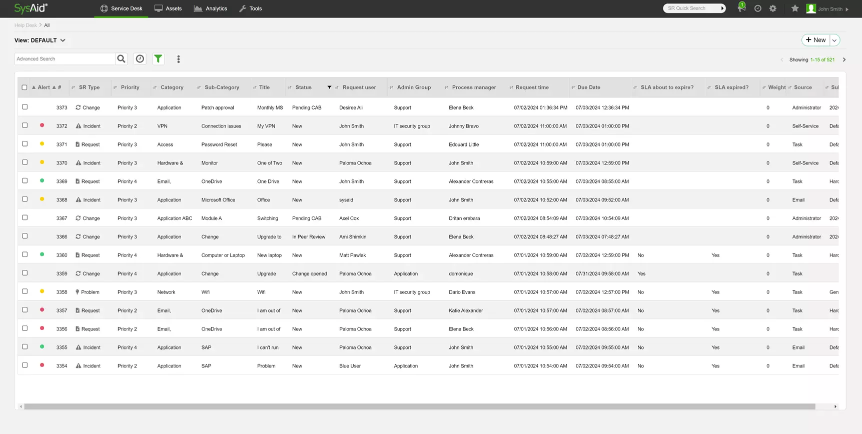
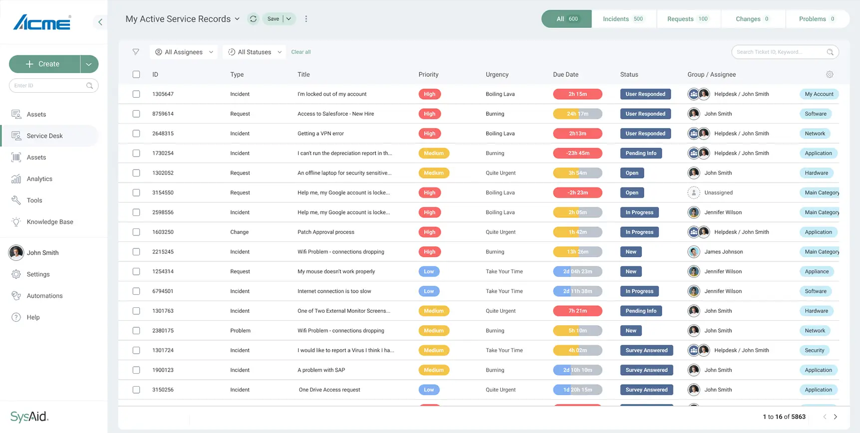
{{ qf.d }}
I rebuilt the single ticket into a focused two-column view with a contextual insight panel (open SRs, relevant KB, time-to-repair) and a clear activity journey - plus complex reusable components like the multi-select assignee.
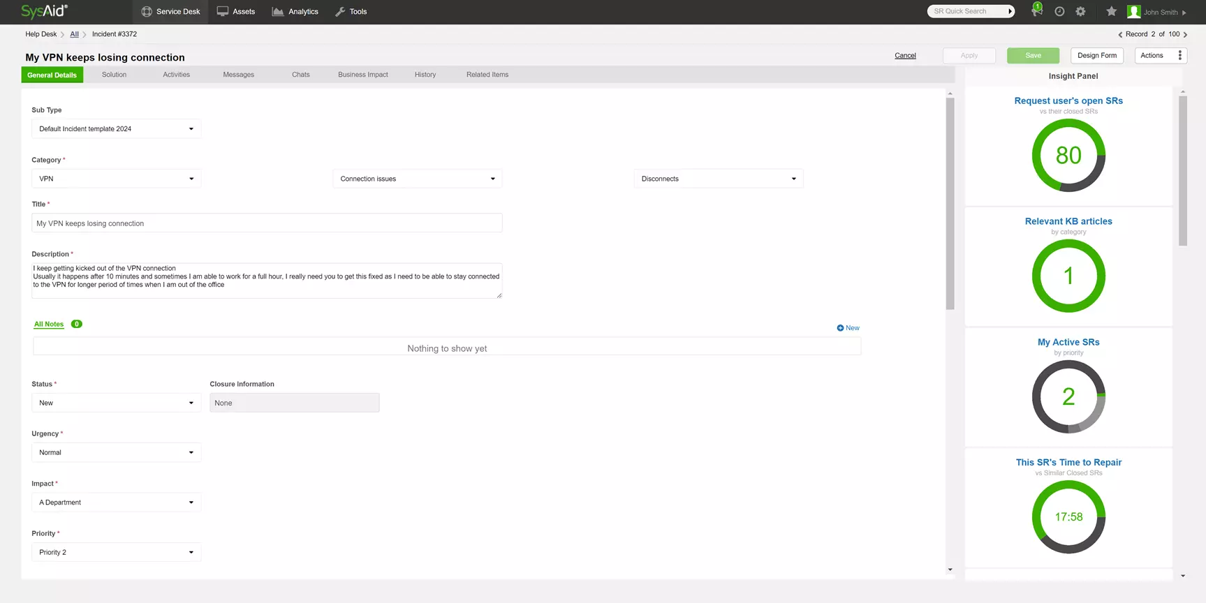
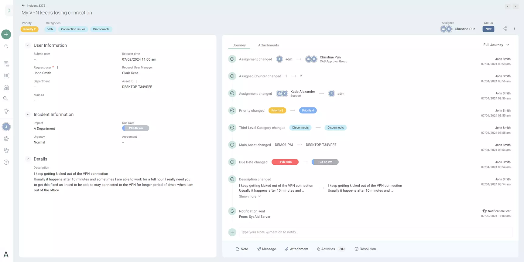
{{ tt.d }}
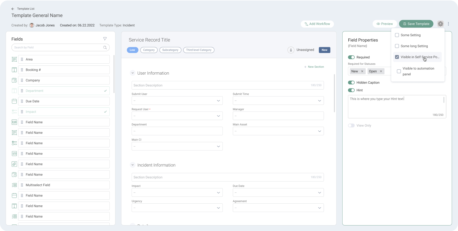
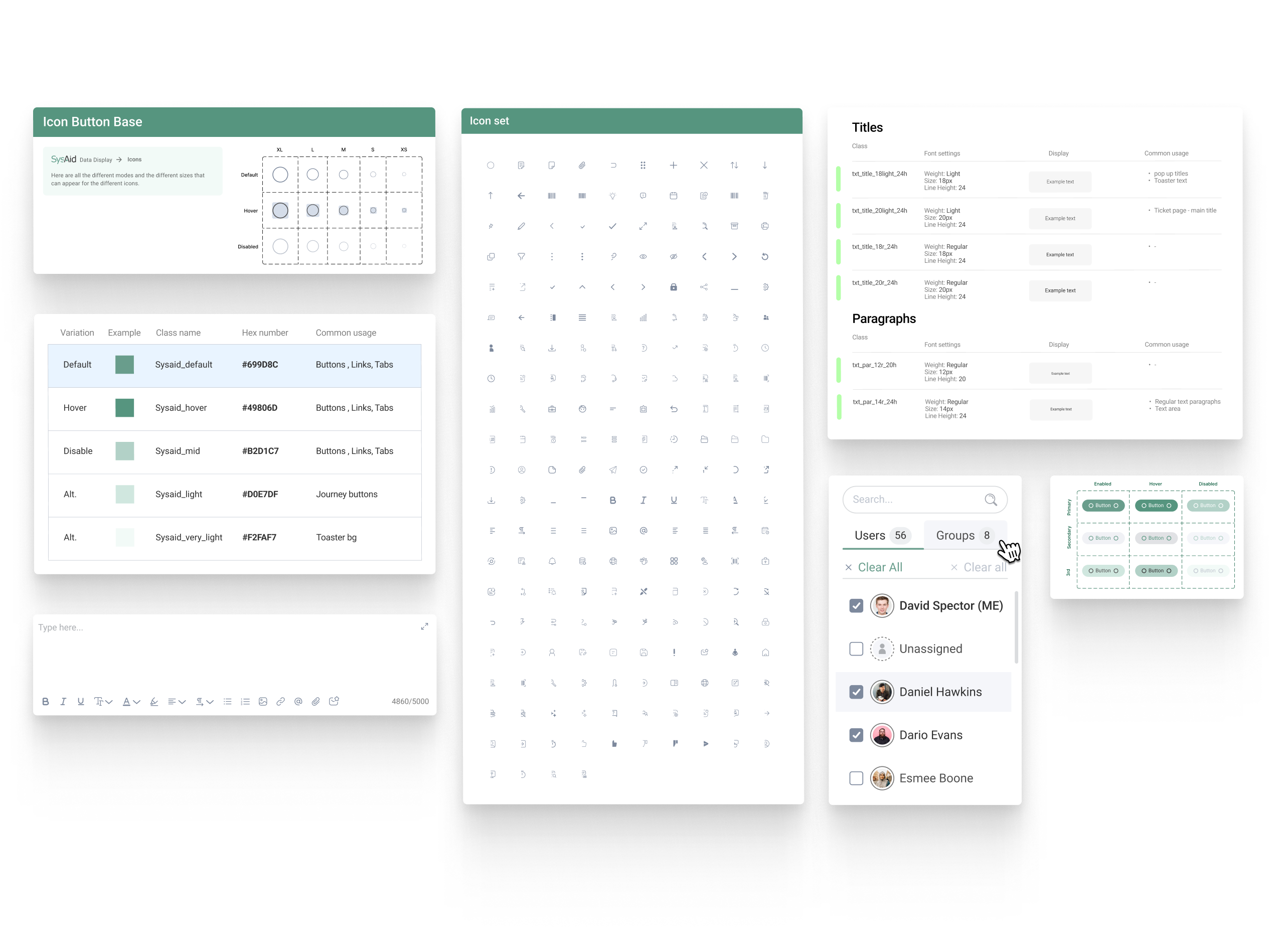
I created and maintained the design system from scratch - color, typography, an icon set, and complex components with every state documented - so the whole platform stays consistent and ships faster.
I stayed close to the product from first research to post-launch measurement - not just the design phase. Each stage fed the next.
{{ ls.d }}
{{ activeCase.metricsNote }}
{{ mt.d }}
Classified means no interviews, no analytics, no recordings. So research became a discipline of proximity: recurring on-site sessions at the client's offices, where the operations manager walked me through how the current system is really used - the commands operators fire most, the failures they chase daily, and how critical uptime is to the whole operation. Every design decision traced back to that picture.
Recurring physical meetings at the client's offices - the only research channel a classified program allows.
The operations manager was the voice of the operators - usage patterns, requirements, and feedback on every iteration.
A mapped inventory of the commands, checks and calibrations operators run daily - ranked by frequency and criticality.
A deep walkthrough of the existing system and the pain it causes every day - the baseline the new design had to beat.
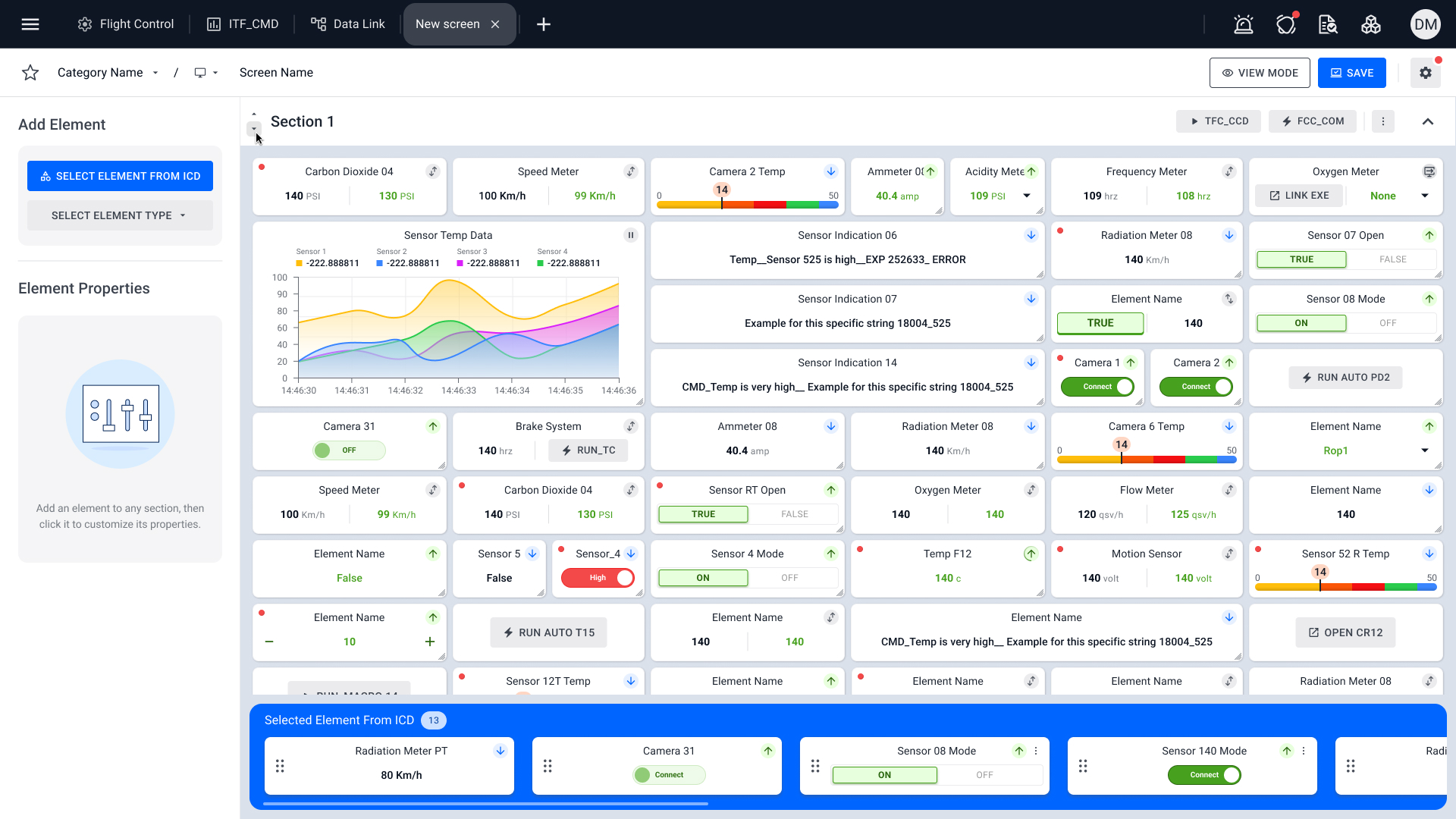
This is the interface operators actually worked in before we arrived - a dense grid of near-identical panels, colour-coded state, and repeated controls with no hierarchy or search. Everything competed for attention at once. It set the bar the new system had to beat, and it is the reason a flexible, no-code, search-first console mattered so much.
With no analytics to lean on, prioritization came straight from the ranked frequent-actions inventory. I mapped every candidate on impact / effort and shipped the quick wins first while the big bets were designed in parallel.
Before committing to build, I ran a CDR - a Concept Design Review with the client and development - to validate a direction both operationally and technically. I brought two concepts to the table.
A 3D hologram of the aircraft as the navigation surface - operators would reach screens by moving through the model. It looked striking, but it never gave real comfort for real-time operation: more gimmick than tool, so I set it aside.
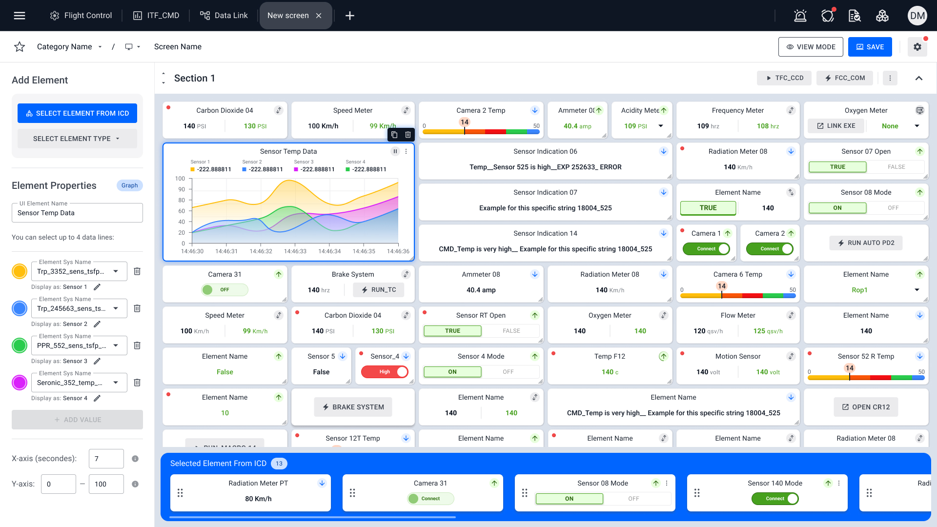
The client and development loved the tabbed workspace, and it earned the technical and practical validation to move forward - it became the operator console that follows.
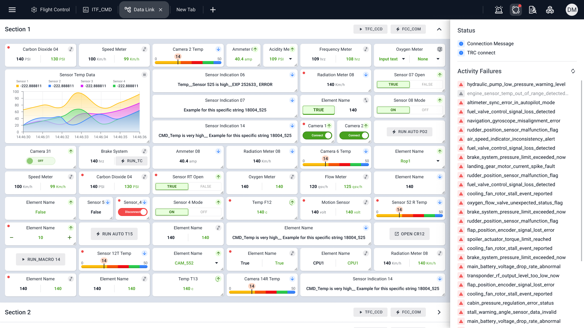
Live telemetry streams into configurable sections - sensors, meters, cameras, toggles and commands - while a status panel surfaces connection state and activity failures the moment they happen. Operators see, decide and act on a single screen, at speed.
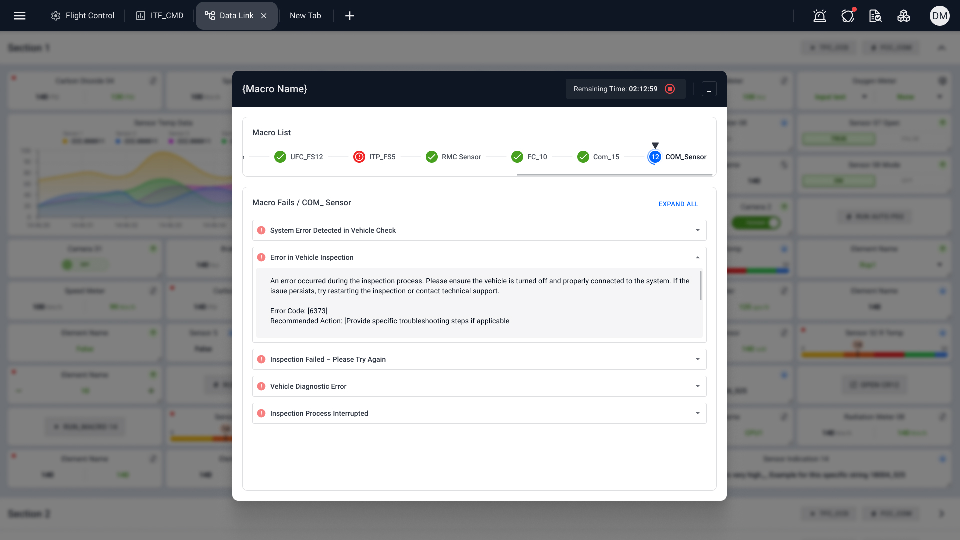
Routine check and calibration flows run as macros - step-by-step sequences with live progress, remaining time, and a drill-down into every failure with its recommended action. Work that used to demand deep technical knowledge became a guided flow operators move through quickly.
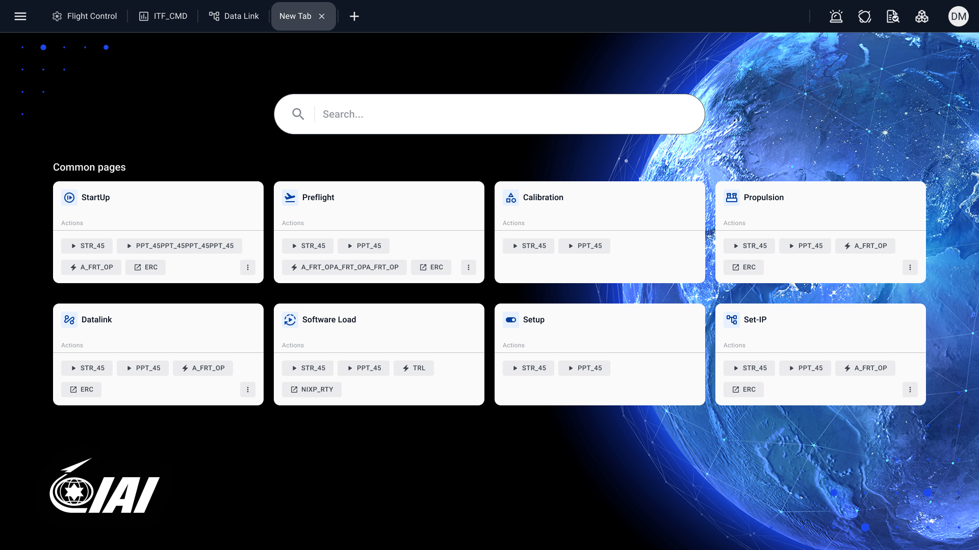
Screens live in tabs, and every new tab opens on search plus the most common pages with their quick actions attached - so reaching any screen or firing a frequent command takes seconds, not menus.
{{ activeCase.dsIntro }}
{{ df.d }}
Real frames from the IAI design-system and Element Index files in Figma - the reference developers implemented against.
Real programs are full of tension between the ideal design, engineering reality, and how people actually work. A few calls I owned:
{{ dc.idea }}
{{ dc.tension }}
{{ dc.call }}
In a classified program I owned the whole arc - from on-site discovery to a production system and the feedback loop that kept improving it.
{{ ls.d }}
{{ activeCase.metricsNote }}
{{ mt.d }}
With a broad public audience and a real accessibility duty, I mapped every decision on impact / effort - shipping the quick wins that helped people find and book fast, while the big bets like accessibility and responsiveness ran in parallel.
{{ activeCase.flowIntro }}
{{ activeCase.styleNote }}
{{ activeCase.mobileIntro }}
As the sole lead designer I carried the portal end to end - from the brief with the PM and Clalit studio to an accessible, responsive product and a style guide that keeps it whole.
{{ ls.d }}
{{ activeCase.metricsNote }}
{{ mt.d }}
{{ activeCase.researchNote }}
{{ r.d }}
{{ rp.d }}
{{ pe.d }}
{{ activeCase.personaNote }}
{{ activeCase.pipelineIntro }}
{{ pl.d }}
{{ activeCase.sysIntro }}
{{ activeCase.themeIntro }}
{{ activeCase.dsIntro }}
{{ df.d }}
{{ activeCase.handoffIntro }}
{{ cw.c }}
{{ activeCase.fidelityNote }}
{{ activeCase.flagshipNote }}
{{ activeCase.mktIntro }}
{{ dc.idea }}
{{ dc.tension }}
{{ dc.call }}
{{ activeCase.statusNote }}
{{ st.d }}